


Most SaaS products lose the majority of their new users in the first week. Not because the product is bad. Because onboarding failed them before they ever had a chance to see the value.
You can spend months improving acquisition — refining landing pages, reducing friction at signup, tuning conversion rates. Then a new user lands inside your product and hits a generic tour, a bloated checklist, and a setup flow designed around your internal architecture instead of their job. That gap is where retention dies.
The fix isn't better animations or more prompts. It's designing onboarding around outcomes, not features.
This guide covers everything you need: how to structure onboarding, what to measure, which patterns still work in 2026, and how to build a system that actually moves users to value.
What onboarding actually is
SaaS user onboarding is not a product tour. It's the entire sequence of product, messaging, and support experiences that moves a new user from signup to first value — then from first value to habitual use.
That distinction matters more than it sounds.
Onboarding includes signup friction, welcome screens, setup flows, checklists, tours, contextual guidance, lifecycle emails, support content, and the path from first action to repeat behavior. Most teams treat it as a single session. That model breaks down in B2B SaaS, where value depends on configuration, collaboration, data import, and habit formation across multiple visits.
Think in three layers instead.
Initial onboarding answers where to start. Activation onboarding gets users to the first meaningful outcome. Adoption onboarding introduces behaviors that expand usage over time.
If the first layer works and the second fails, activation stalls. If the second works and the third fails, users plateau after a promising start. You need all three.
Why traditional onboarding underperforms
Most onboarding looks polished and still fails. The problem isn't effort. It's mismatch.
Here's where traditional onboarding breaks.
Assuming every user wants the same thing
A founder testing your product alone, a product manager evaluating workflow fit, and a customer success lead onboarding a team don't arrive with the same goal, urgency, or success criteria. A single linear tour forces all three into one path.
That's why so many onboarding experiences feel busy without feeling helpful. They explain the interface instead of clarifying the fastest route to a result.
Introducing features before value
Feature exposure isn't onboarding. Users aren't trying to memorize your UI. They're trying to solve something that matters to them right now.
If your first-run experience marches through navigation items, settings, and secondary features before a user reaches a useful outcome, you're increasing cognitive load before trust exists. That's a losing trade.
Optimizing for completion, not value
A checklist can show 72% completion and still be weak. Completion only matters if the steps actually move users closer to activation.
Teams sometimes add easy tasks to make the checklist feel engaging, then mistake motion for progress. Don't do that.
Staying static when behavior changes
A user who's already imported data shouldn't keep seeing import prompts. A user who skipped the checklist but found value through templates needs advanced guidance, not beginner nudges.
Static onboarding keeps repeating itself after the product already knows better. Better onboarding in 2026 isn't about more prompts. It's about relevance.
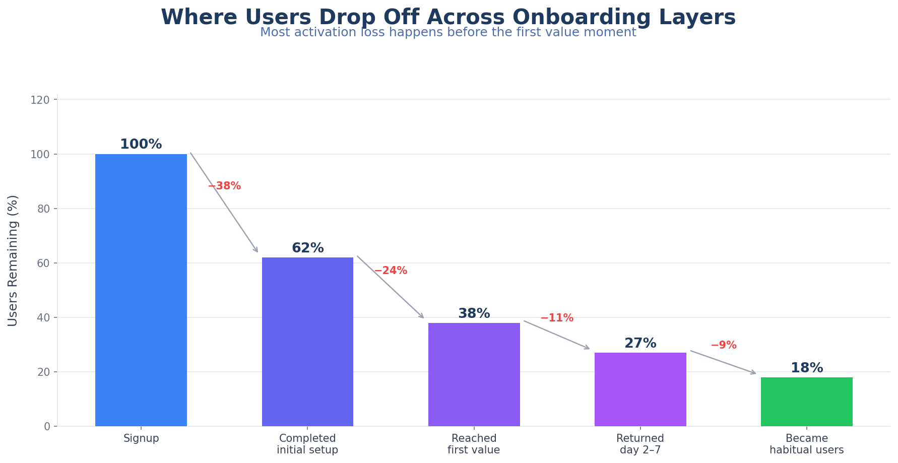
The core goal: time-to-value
The fastest way to improve onboarding is to stop trying to teach everything upfront.
New users don't need comprehensive understanding. They need orientation, confidence, and a clear path to a result they care about. Optimize for time-to-value first, product comprehension second.
For most SaaS products, the first value moment isn't "finished the tour." It's closer to one of these:
- Created a first project
- Imported data successfully
- Launched a survey or announcement
- Completed a workflow with real inputs
- Invited teammates into a shared workspace
- Saw a useful insight or report
- Published a live artifact inside the product
When you anchor onboarding to those outcomes, the flow gets cleaner immediately. Welcome screens get shorter. Checklists lose filler. Tours become contextual instead of mandatory. Emails start reinforcing unfinished value instead of recycling generic product education.
If you have to choose between a user understanding six features and a user succeeding with one important workflow, pick the workflow every time.
Five building blocks of modern onboarding
High-performing onboarding systems use the same components. The implementation varies, but the structure is consistent.
1. Segmentation at the start
You don't need a long intake survey. You need enough context to avoid showing the wrong path.
Useful segmentation usually comes from a few inputs: role, primary goal, company size, whether the user is evaluating solo or for a team, and technical depth when setup complexity varies.
The mistake is asking for too much before value begins. Keep the prompt short, explain why the question matters, and use it to meaningfully change the next few steps. A welcome question that leads nowhere trains users to ignore everything else.
2. A visible activation path
Users should be able to see what progress looks like.
This is where checklists still work — when they're designed around outcomes instead of chores. A good onboarding checklist translates product complexity into a small number of useful steps. A weak checklist mirrors the product's internal setup menu.
Visible progress reduces ambiguity. It also gives your lifecycle messaging something concrete to reinforce.
3. Contextual guidance
Good onboarding guidance appears where a decision is being made, not all at once on day one.
Tooltips, hotspots, modals, and walkthroughs are most effective when they solve immediate uncertainty. They underperform when they narrate the interface long before a user needs the information.
Contextual tours often outperform mandatory product tours for exactly this reason: they respect the user's momentum. Our post on product tours for activation covers this in more detail.
4. Lifecycle follow-up
Many products require more than one session to activate. That makes lifecycle messaging part of onboarding whether teams acknowledge it or not.
The strongest follow-ups are tied to actual progress states:
- Signed up but never started setup
- Started setup but stalled before first outcome
- Reached first value but didn't return
- Activated as an individual but hasn't invited teammates
Each of those states needs a different message. Not a recycled landing page.
5. Post-activation expansion
Onboarding shouldn't disappear right after first success.
Once a user reaches the first useful outcome, the challenge is turning isolated value into product habit. That usually means introducing one deeper capability at the right moment: collaboration, automation, reporting, templates, advanced workflows.
Most teams lose momentum here. They treat activation as the finish line, then wonder why breadth of adoption stays shallow.
Designing for user intent
The best onboarding flow usually feels shorter than it is, because it removes irrelevant work. Here's how to map each stage to what the user actually needs.
Stage 1: Orientation
The user is asking: Am I in the right place, and what should I do first?
At this stage, answer:
- What the product helps them do
- Which path fits their use case
- How long the first win should take
- What they need to get started
Welcome screens, role prompts, starter templates, and short setup directions work here. Dense tours don't.
Stage 2: Setup
The user is asking: What do I need to configure before this works?
Setup requirements are real. The problem is when products present setup without prioritization. Separate essential setup from optional setup. Show dependencies clearly. If a user needs one integration and two core actions before value appears, keep the path narrow and explicit.
Stage 3: First outcome
The user is asking: Did this produce something useful yet?
This is the moment your onboarding should be built around. The first live campaign, the first synced dataset, the first published survey — whatever "value delivered" means in your product.
If the product reaches this moment quickly, motivation rises. If the path is long or abstract, users start evaluating effort instead of outcome.
Stage 4: Reinforcement
The user is asking: Was that worth it, and what do I do next?
Show the result clearly. Name what changed. Point to the logical next action. Good reinforcement is concrete: it shows completion, time saved, progress unlocked, or the next recommended step for the user's segment.
Stage 5: Habit formation
The user is asking: How does this become part of my normal workflow?
Introduce recurring use cases, team collaboration, automations, reporting, or adjacent features only after the first value moment is secure. Users learn through value accumulation, not encyclopedic introduction.
The patterns that actually work
Not every pattern fits every product. But a few are especially effective right now.
Goal-based welcome routing still works extremely well. Short welcome flows that ask what the user wants to accomplish reduce irrelevance early. The key is to route meaningfully — if every answer leads to the same setup, skip the question.
Template-led onboarding is one of the fastest ways to reduce blank-page friction. Templates help users see a finished state before they have to construct one. This works especially well in products where value is easier to understand from an example than from a tour.
Checklist-led activation remains effective when tied to a real activation sequence. Steps should represent meaningful outcomes, optional tasks should be separated from core tasks, and each step should open directly into the relevant action. We covered the mechanics in how checklists and personalized guides accelerate product adoption.
Contextual tours are stronger than one-size-fits-all walkthroughs for most B2B SaaS products. They appear only when needed, inside the action the user is already trying to complete. That lowers resistance and improves learning because guidance is attached to intent.
Assisted onboarding for high-friction accounts matters more than many teams admit. Some accounts are worth more, have more setup complexity, or need higher confidence before rollout. Concierge migration help, setup reviews, implementation check-ins — the strongest teams combine self-serve guidance with selective human assistance based on account value and onboarding risk.
Metrics that actually matter
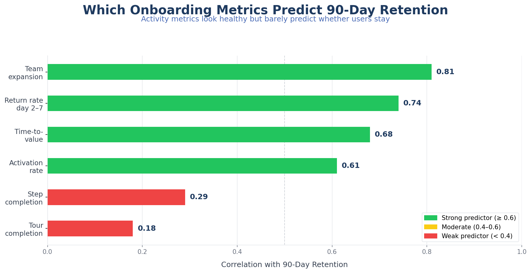
If you want to improve onboarding, measure user progress rather than activity volume.
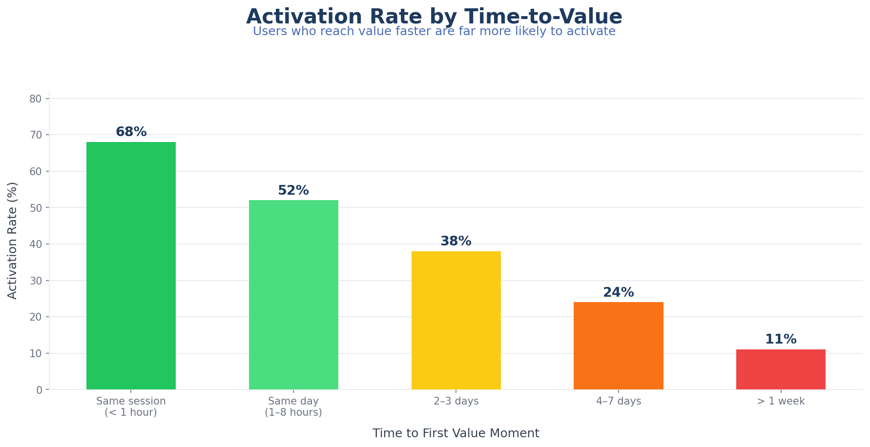
Time-to-value measures how long from signup to the first meaningful outcome. It reflects user effort directly. If it's long, more users give up before they get there.
Activation rate measures what percentage of new users complete the actions that predict retention or expansion. Define this narrowly enough to matter. Too soft, and it becomes an inflated milestone with weak predictive value.
Step completion drop-off shows where users stall or abandon the flow. It identifies whether friction is concentrated in one step, distributed across the journey, or tied to a specific segment.
Return rate after first session shows whether users come back after the initial visit. For many SaaS categories, first-session completion isn't realistic. Return behavior becomes a useful signal that the product created enough promise to deserve another attempt.
Team expansion signals show whether activated users invite collaborators, connect more data, adopt adjacent features, or build repeat workflows. These tell you whether onboarding produced durable product use rather than isolated trial behavior.
Connect every onboarding metric to retention and revenue logic. If a metric looks healthy but doesn't correlate with downstream success, you're measuring the wrong thing.
Common mistakes
Teams rarely fail because they ignore onboarding. They fail by implementing too much of the wrong kind.
Mistaking explanation for enablement. A long tooltip sequence can explain the interface thoroughly and still leave the user unable to achieve anything useful. Knowing where the button is isn't the same as knowing why to press it.
Piling every best practice into the first session. Checklists, hotspots, tours, welcome modals, empty-state tips, lifecycle emails, and live chat can all be useful. Together without restraint, they create noise. Orchestration matters more than feature count.
Using the same path for trial users and buyer-led accounts. A self-serve trial motion and a sales-assisted motion may share product infrastructure, but the onboarding needs are often different. Treat them differently.
Ignoring emotional friction. Users abandon because the path feels uncertain, repetitive, or risky — not just because steps are long. Clear expectations, progress visibility, and reassurance around setup complexity matter.
Waiting too long to personalize. By the time your product identifies intent after ten generic steps, trust is already gone. Personalization doesn't need to be elaborate. It needs to happen early enough to remove irrelevant work.
A framework for building better onboarding
If your current onboarding is underperforming, rebuild it in this order.
- Define the activation outcome. What specific user result best predicts retention?
- List the minimum actions required to reach it. Remove tasks that are nice to have but not necessary.
- Segment users by starting intent. Use a small number of meaningful paths.
- Design the shortest route for each path. Keep setup scoped to what unlocks first value.
- Add contextual guidance only where uncertainty is high. Don't narrate the whole product.
- Instrument the journey. Measure drop-off, time-to-value, return behavior, and downstream expansion.
- Add lifecycle follow-up by progress state. Reinforce the next useful action, not generic product education.
- Expand after activation. Introduce advanced or collaborative use cases only after the core flow is working.
That sequence is less glamorous than redesigning every onboarding screen. It's usually more effective because it forces clarity before surface polish.
Where AI fits in
AI is becoming useful in onboarding, but the strongest use cases are narrower than the hype suggests.
The best applications right now:
- Recommending the next best step based on user behavior
- Adapting guidance copy to the user's role or context
- Flagging high-risk drop-off patterns for human follow-up
- Summarizing setup status and blockers for success teams
- Improving help content discovery inside the product
AI helps most when it reduces irrelevance or accelerates intervention. It helps less when teams use it to generate more generic copy or more prompts without addressing structural friction.
Our earlier guide on AI-powered user onboarding goes deeper on this. The main takeaway: AI strengthens onboarding systems that already have a clear activation model. It doesn't replace one.
The standard worth aiming for
The strongest SaaS onboarding in 2026 isn't the most animated, elaborate, or feature-rich. It's the onboarding that gets users to useful progress quickly, adapts to intent early, and expands naturally after the first win.
If your onboarding still revolves around explaining the interface, it's too broad. If it forces every user into the same sequence, it's too rigid. If it celebrates checklist completion more than customer outcomes, it's measuring comfort instead of value.
A better onboarding system does three things well: it identifies what the user is trying to accomplish, it shortens the path to the first meaningful result, and it keeps teaching only after value has begun.
That's the standard worth aiming for.
Build onboarding flows that guide users to value faster