Here's a question that probably keeps you up at night: What if the most valuable feedback your customers are giving you has nothing to do with what they're typing?
We've built a religion around the survey. The NPS form. The feedback button. The support ticket. We've convinced ourselves that if it's not explicitly stated, it doesn't count. But here's the uncomfortable truth - customers are screaming at you every single day through behavior you're completely ignoring.
Your user just spent 47 minutes on a three-step onboarding flow. Your power user hasn't logged in for six days. Your trial user clicked the same button eight times in succession before rage-quitting. These aren't random events. They're feedback. They're loud feedback. And you're probably missing all of it.
This deep dive is about something most product teams get fundamentally wrong: feedback collection isn't a single channel you activate at signup. It's an entire ecosystem of signals - some explicit, most invisible - that together tell you everything about whether your product is actually working.
Let's talk about what you're doing right. And more importantly, what you're probably screwing up.
Three Feedback Types
Your customers communicate through three distinct channels, and treating them equally is amateur hour.
Direct feedback is what you think of when you hear "feedback." It's intentional. Customers filled out a form, rated your product, or typed a message. It's the stuff you see.
Indirect feedback is unsolicited truth. It shows up in support tickets where customers are complaining about problems you didn't ask them to report. It lives in social media mentions you weren't monitoring. It's the honest stuff people share when they think you're not listening.
Inferred feedback is the invisible layer. It's the data that exists whether customers want to give it or not - their actual behavior, divorced from what they say they do. It's the most honest, the most revealing, and the one almost everyone gets wrong.
Here's the kicker: most teams over-index on direct feedback and completely ignore inferred feedback. We ask customers "How satisfied are you?" and then ignore that they haven't used the core feature in three weeks. We celebrate a high NPS score and miss that 40% of signups never activated.
The feedback you should actually care about isn't the customer telling you they're happy. It's the customer showing you they're leaving.
Part 1: Direct Feedback
Let's start with the obvious, because you need the foundation before you can build the interesting bits.
Survey Metrics
Three surveys dominate the landscape: NPS, CSAT, and CES. They measure different things, and yes - you probably need more than one.
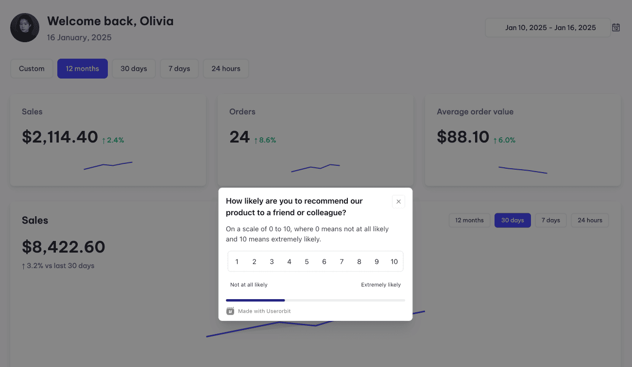
NPS (Net Promoter Score) asks the simplest possible question: "How likely are you to recommend us to a friend?" A 0-10 scale bins users into three buckets: Promoters (9-10), Passives (7-8), and Detractors (0-6). Your NPS is the percentage of promoters minus detractors. Range: -100 to +100.
Here's what NPS actually measures: long-term loyalty and brand sentiment. It's brilliant if you want to know whether customers think you're worth talking about. It's useless if you want to know what specifically frustrated them.
For context, the average SaaS NPS is around 27. Anything above 50 is genuinely exceptional. But here's what everyone gets wrong - a 45 NPS doesn't tell you whether your problem is onboarding, pricing, feature depth, or customer support. It just tells you customers aren't rabid evangelists.
CSAT (Customer Satisfaction Score) flips the question. Instead of "How loyal are you?", CSAT asks "How satisfied were you with this specific thing?" Typically 1-5 scale. It's transactional. Ask it right after someone completes a support interaction, finishes onboarding, or uses a new feature.
CSAT is your early warning system. Low CSAT after a feature launch? Users aren't getting value. Low CSAT after support interactions? Your team isn't solving problems. CSAT after checkout flow? You're leaking conversions.
Average CSAT in SaaS hovers around 75-85%, which honestly isn't that impressive.
CES (Customer Effort Score) measures one thing: How hard was this? The question: "The company made it easy for me to solve my problem" on a 1-7 scale. CES is obsessed with friction.
CES doesn't tell you if they love you. It tells you if they can get what they need without pulling their hair out. Use it for checkout, feature configuration, onboarding, any place where friction kills conversion.
The honest truth about all three: If you're running monthly NPS surveys and that's it, you're basically guessing. Use NPS quarterly for strategic insight. Use CSAT tactically - immediately after specific moments. Use CES when you suspect you've added unnecessary friction somewhere.
Open-Ended Analysis
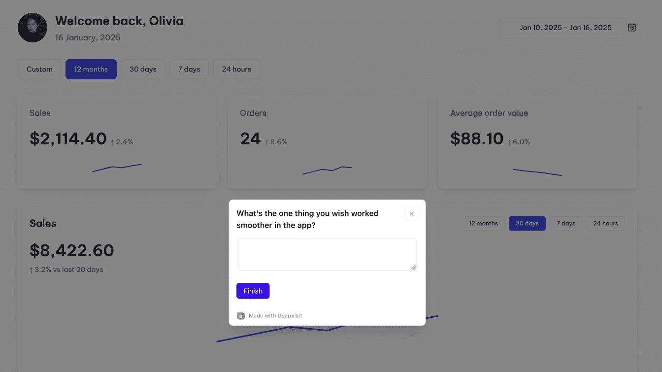
Every survey with a comment field is a mini focus group you're not paying attention to. "How can we improve?" generates 95% noise and 5% signal - but that 5% is often gold.
The problem: open-ended text doesn't scale. You get 100 responses and you're staring at a text file thinking "well, this is useless."
The solution: Don't read them yourself. Let AI extract the themes automatically. Modern NLP can identify patterns across hundreds of responses - what problems repeat, what language gets emotionally charged, where users are aligned vs. polarized.
Feedback that appears once? Maybe noise. Feedback that appears in 15 responses? That's a signal you need to investigate.
Feature Request Management
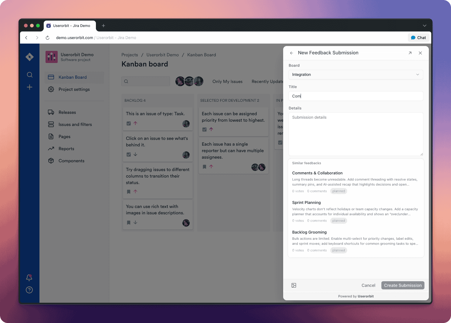
Here's a stat that should terrify you: over 60% of feature requests from customers never make it to the product team. They get lost in Slack, buried in support tickets, forgotten in email threads.
When customers can't easily request features or see what's planned, something breaks. They stop providing input. They assume you don't care. They leave for a competitor that seems more responsive.
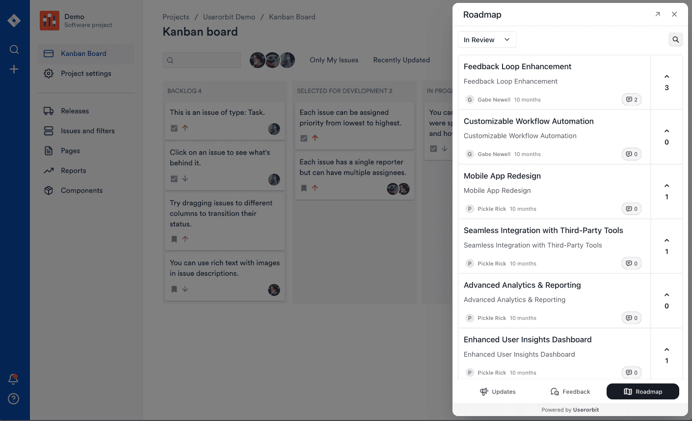
Public roadmaps with voting mechanisms fix this. Users submit ideas. Other users upvote. You ship features. You update the roadmap. You close the loop. Users feel heard.
This isn't magic - it's just respect in product form. When customers see their requests influence your decisions, they stop being passive users and become invested stakeholders.
Bug Report Optimization
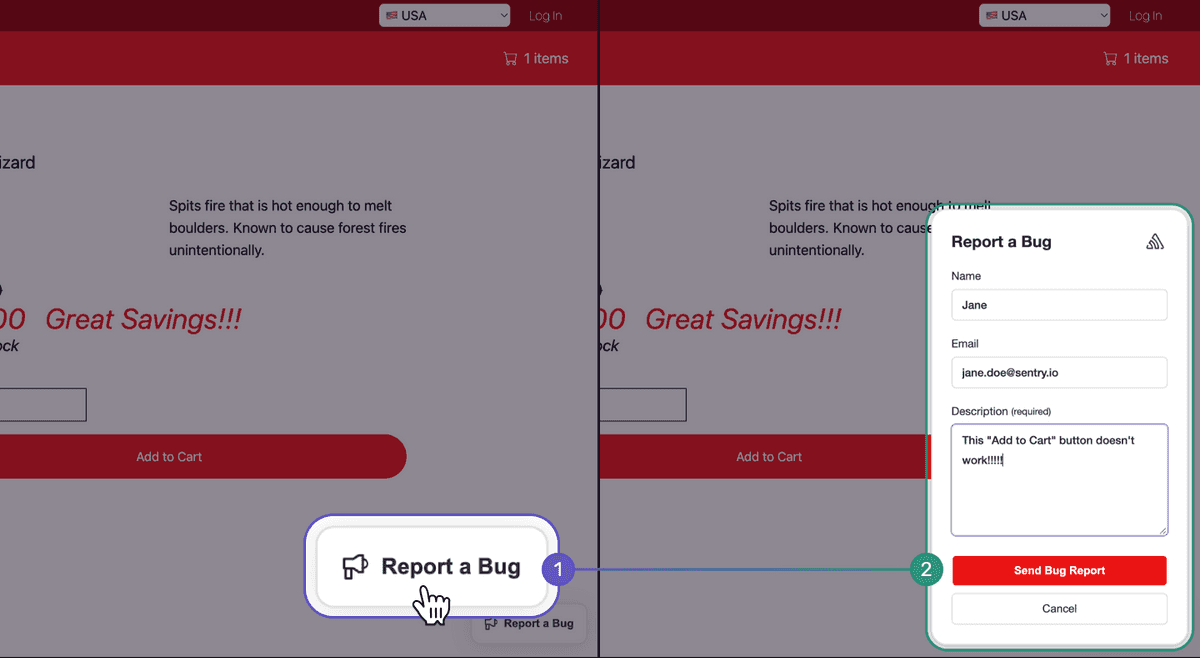
A well-structured bug report includes the essential context: what happened, what should have happened, how to reproduce it, browser/device info, and ideally a screenshot showing the moment of failure.
Most users don't give you that level of detail spontaneously. They just say "your app crashed." But if you ask for context systematically, if you provide visual annotation tools, if you make bug reporting friction-free - you get information that saves your developers hours of investigation.
The best bug reports feel like conversations. User submits. You acknowledge. You investigate. You fix. You tell them it's fixed. They feel like participants in solving the problem, not like they're shouting into the void.
Part 2: Behavioral Signals
This is where most product teams check out. Explicit feedback is easy - it requires a form and a little patience. Implicit feedback requires you to actually think about what behavior means.
But here's the thing: the feedback that predicts churn isn't a 3-star CSAT. It's the user who stopped logging in. The feedback that reveals your onboarding is broken isn't a complaint - it's a trial account that never hit the activation moment.
Activation Metrics
Imagine two users: both signed up this morning. By tomorrow, one has experienced genuine product value. The other hasn't figured out what the product does.
That inflection point - where a user discovers real value and commits to the product - is called activation. And if you're not tracking it precisely, you're flying blind.
Activation looks different for every product, but the pattern is universal. Your users need to complete a specific sequence of actions to understand why they signed up. Banking app? They transfer money. Note app? They create and sync a note. CRM? They add a contact and send an email.
Here's the brutal truth: if you can't clearly define your activation event, users can't actually find it.
Activation Rate measures what percentage of new users hit that moment. If 100 sign up and 24 activate, your activation rate is 24%. For context, the average feature adoption rate across SaaS is 24.5% - which means three-quarters of your user base never fully explores your core capabilities.
Time to Activation measures how long the journey takes. Users who activate within 10 minutes convert at dramatically higher rates than users who take 3 days. The longer activation takes, the more likely they never make it.
This is your most important feedback channel. Not because users are telling you anything - they're not. But because their behavior is screaming a specific message: "I don't see why I should keep using this."
When activation metrics drop, something broke in your onboarding. When new cohorts activate slower than old cohorts, you've made the product harder to understand. When segments activate at different rates, some user types struggle more than others.
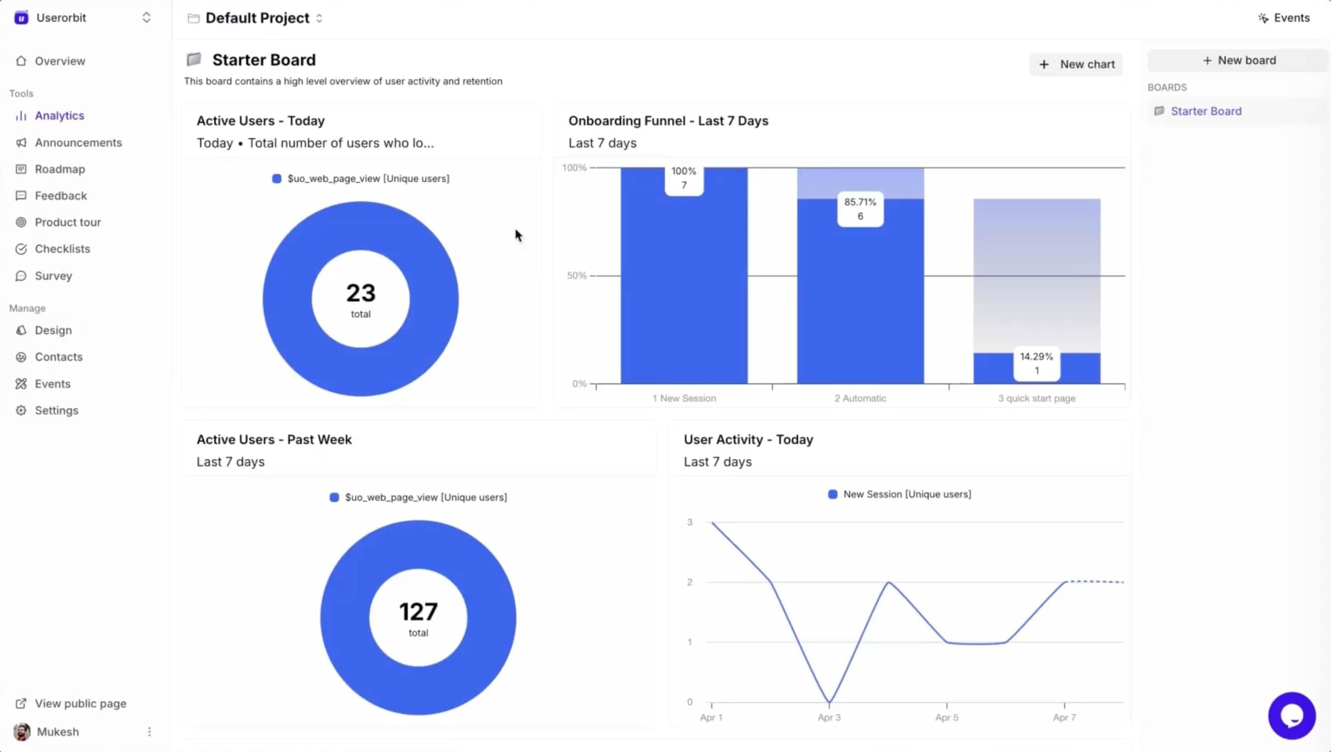
Quick test: Can you describe your product's activation event in one sentence? If you can't, users can't find it.
Feature Adoption Tracking
You shipped a feature last month. You're proud of it. It's objectively better than the competitor's version. Users are going to love it.
Two weeks later, you check usage: 8% of your user base has touched it.
This happens all the time. Features don't fail because they're poorly built. They fail because users don't know they exist. They don't understand why they should use them. They activated through a different path and the feature never crossed their radar.
Feature adoption tracking shows you exactly which capabilities are thriving and which are invisible. The depth of adoption - are users just trying it or integrating it into workflows? - reveals whether features are actually solving problems or just occupying space.
When a feature has deep adoption, users are coming back repeatedly. They've built muscle memory. It's part of their routine. When adoption is shallow, users tried it once, didn't get value immediately, and moved on.
The feedback here is straightforward: your feature isn't worth discovering.
This could mean:
- The UI is confusing
- The value proposition isn't obvious
- It's in the wrong place in the product
- It only solves a rare problem
- Users solved it a different way first
The only way to find out is to instrument it, watch behavior, and then - this is critical - ask the people who aren't using it why they aren't.
Churn Prediction Signals
Nobody wakes up and thinks "today's the day I cancel my SaaS subscription." Cancellation is the final step in a sequence of behavioral changes that happened weeks or months before.
Here are the signals that predict churn with eerie accuracy:
Declining login frequency is the most obvious. If a user who logged in daily is now logging in weekly, something's changed. They might be traveling, they might be busy, or they might be losing faith in your product. A user logging in less than once per week has 3x higher churn risk than weekly or more frequent users.
Falling feature engagement is the next domino. The user still logs in, but they're only checking one thing - usually something basic like reviewing their data. They're not exploring, not iterating, not creating. They're in read-only mode.
Support ticket spikes without resolution is a warning flare. A user who suddenly has five support tickets in a week might be trying to use the product but hitting repeated walls. Or they might be working through their concerns before they decide to leave.
Core feature abandonment is the moment you should really panic. The user signed up because they needed your main capability. Now they're not touching it. They've found another solution, or they've concluded your product isn't actually solving their problem.
Payment failures or downgrades aren't errors - they're decisions. A user upgrading to a lower plan is already leaving; they're just moving slowly. Multiple failed payment attempts could be accident, or could be hesitation.
The feedback here is almost too honest: "I'm leaving." The only question is whether you've noticed in time to intervene.
Your action: Pick one churn signal you're currently NOT tracking. Start tracking it this week. You'll immediately find users you didn't know were at risk.
Time-on-Task Analysis
You're looking at your analytics and you see that users spend an average of 8 minutes on your onboarding flow. That seems good, right? Engaged, thoughtful, deliberate.
What if they're actually stuck?
When users should complete a task in 2 minutes but consistently take 8, that's not engagement. That's confusion. That's someone clicking around trying to find where to next, or re-reading instructions because the UI didn't make sense, or giving up internally while still technically on the page.
This is subtle feedback, easily missed. Analytics don't flag it. Users don't complain about it. But it's absolutely indicative of UX failure.
Watch for outliers. If most users cruise through a flow in 90 seconds, but some users linger for 12 minutes, investigate. Either those long sessions are engaged power users (check if they convert at higher rates), or they're confused users who eventually abandoned.
The signal is: "This is harder to use than it should be."
Email Engagement Metrics
You spent weeks crafting the perfect onboarding email sequence. Thoughtful copy. Compelling CTAs. Clear value proposition. You hit send and... 40% of users never open them.
Even worse, 25% who open them don't click through.
This is feedback about your messaging, timing, or relevance. It might mean:
- Timing is off: You're emailing when users are overwhelmed or distracted
- Value isn't obvious: Subject lines aren't compelling enough to earn the open
- Content isn't relevant: Users who signed up for one use case are getting guidance for a different one
- You're emailing too much: Users tuned you out three messages ago
Email engagement is straightforward to measure and often revealing to act on. If onboarding emails have 60% open rates but help center emails have 15%, you've learned something specific: users in crisis are more motivated than users in the tutorial phase.
Use this signal to adjust timing, segmentation, personalization, and frequency. What works for power users might not work for beginners.
Part 3: Hidden Feedback Sources
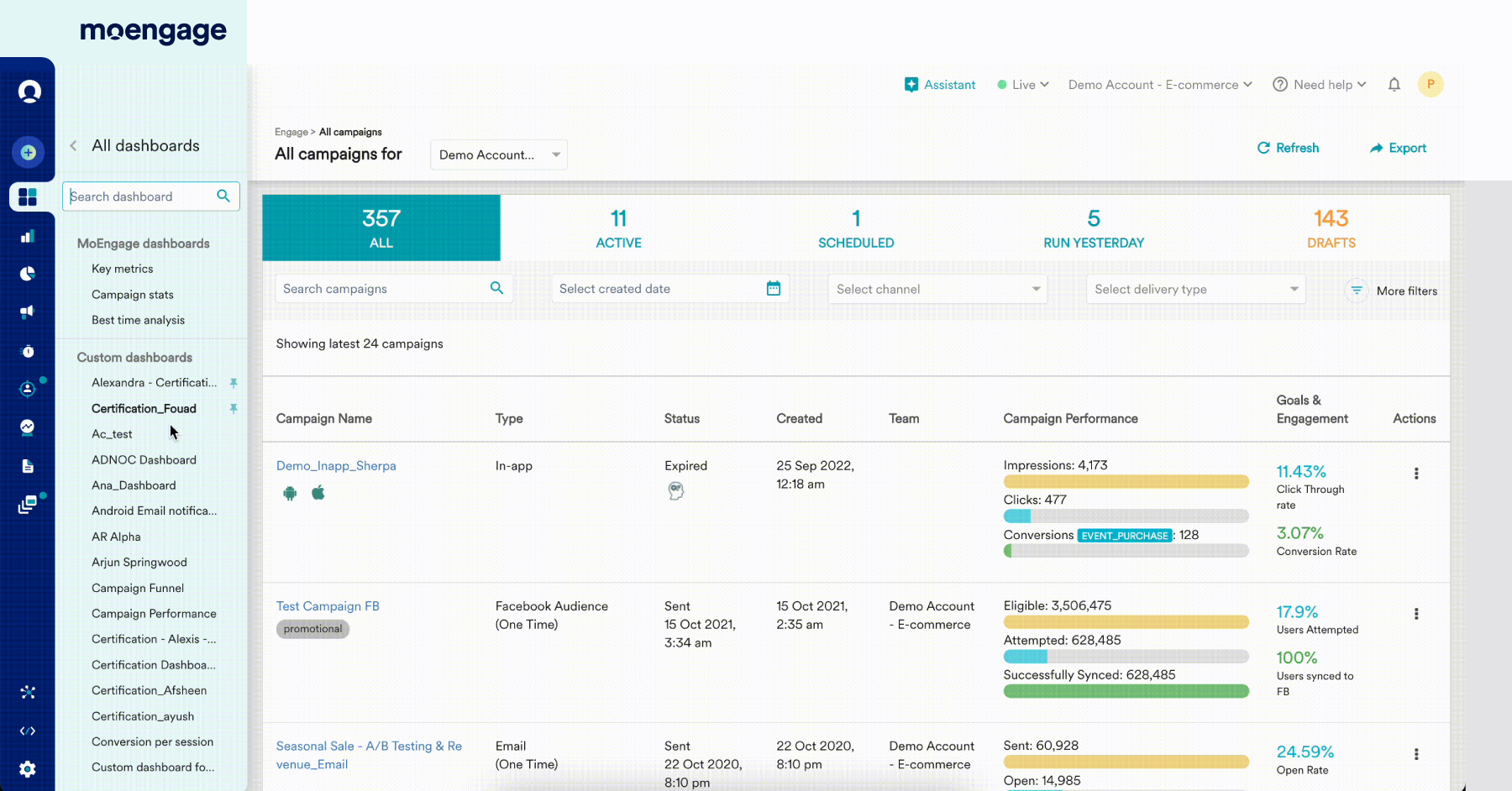
Support tickets, help center searches, announcement clicks, documentation access patterns - these are all feedback channels you've probably already instrumented. Most teams just never think of them that way.
Support Ticket Analysis
Your support team is sitting on a goldmine of feedback about what's genuinely broken, confusing, or missing in your product.
When users contact support, they're telling you something explicit: "I couldn't figure this out on my own." That might mean your UI is confusing. It might mean your documentation is missing. It might mean you shipped a feature that works differently than users expect. It might mean there's a bug nobody's discovered yet.
Analyzing support tickets for patterns reveals recurring problems. If 40 users submit tickets about the same feature, that's a signal to revisit whether the feature is working as intended or if your guidance is insufficient.
The pattern matters more than the individual ticket. One user complaining about something is feedback. Seven users complaining about the same thing is a problem you need to fix.
Help Center Analytics
When users actively search your help center, they're providing granular feedback about what's confusing.
High search volume for a topic you haven't documented? You found a gap. High search volume for a topic you have documented? The documentation isn't answering the question.
Watch what users search for. Watch what they click on. Watch where they get stuck. This tells you exactly what's confusing about your product and where self-service guidance would have the highest impact.
Users who find the answer themselves and keep using your product - that's a success. Users who search, don't find what they need, and then disappear - that's a churn signal hiding in plain sight.
Announcement Tracking
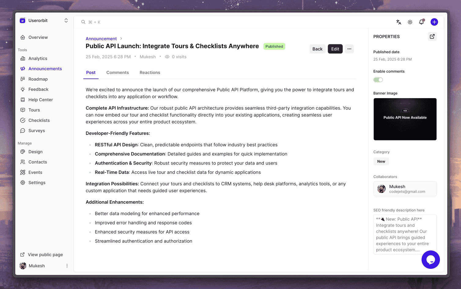
Every in-product announcement, email, or changelog is an opportunity to measure customer interest and engagement.
When you announce a new feature and 60% of users open the announcement but only 2% actually use the feature, you've learned something valuable: users care enough to see what's new, but the feature isn't compelling enough to try.
This is feedback about feature discoverability, marketing, or value proposition - not the feature itself.
Compare engagement rates across announcement types. Do users engage more with feature announcements or maintenance updates? Does engagement correlate with actual product usage changes? What happens to users who engage with announcements vs. those who don't?
Part 4: Advanced Signals
Let's get into the spicy stuff.
Rage & Dead Clicks
Users don't just browse your product - they interact with it. Sometimes in frustration.
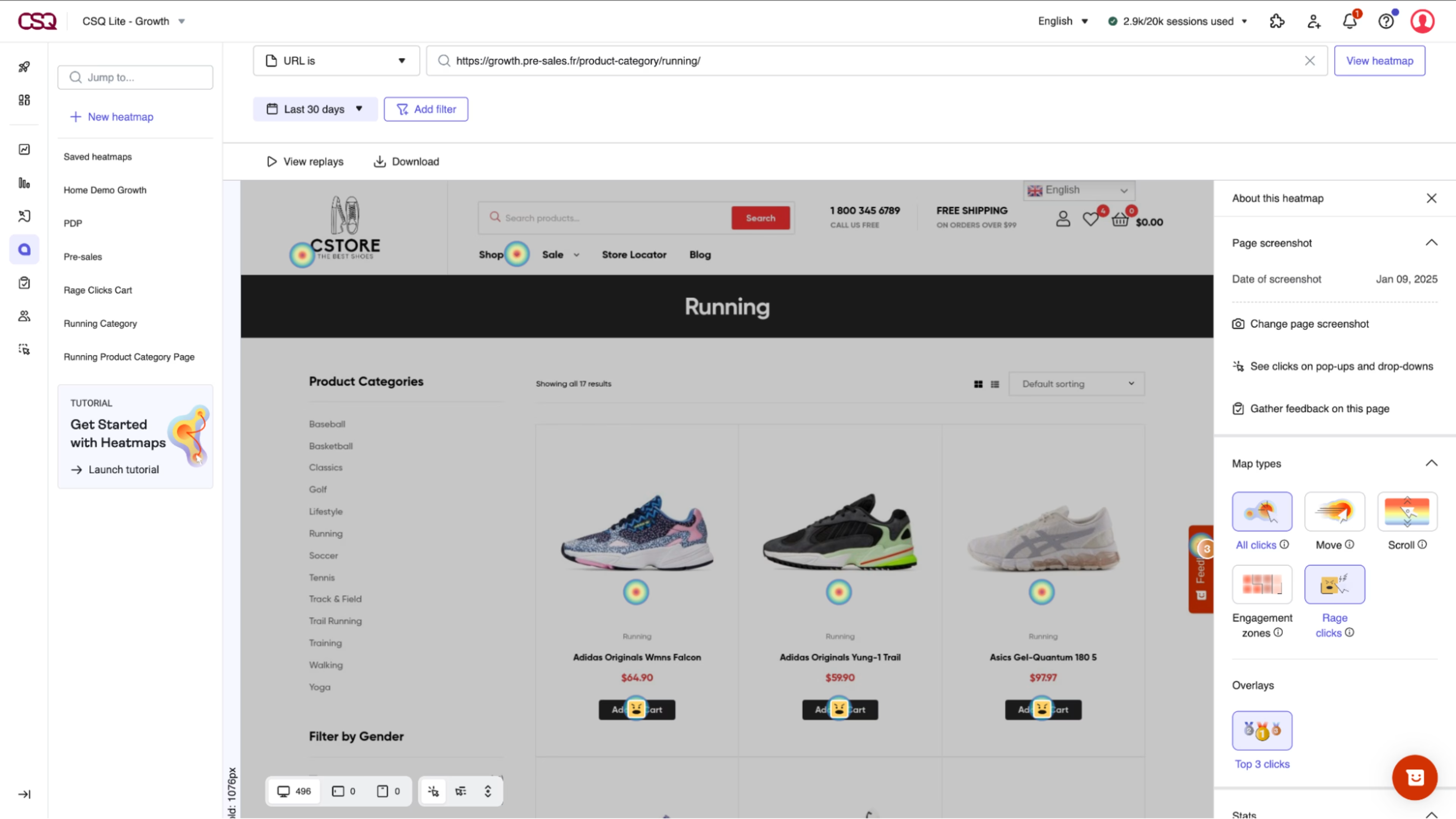
Rage clicks happen when users repeatedly click the same element in quick succession (typically 3+ times within 2 seconds). They're clicking a button that should work but isn't responding. They're clicking what looks like a link but isn't interactive. They're trying to dismiss something that won't go away.
Rage clicks are pure, unfiltered frustration. Your UI promised interactivity. Your UI didn't deliver. Users are literally mashing buttons in anger.
Dead clicks are clicks on non-interactive elements. Users saw something that looked like a button and clicked it. You built the UI to look interactive but didn't build the functionality. That's a design failure.
These signals exist in every product. Most teams have no idea they're happening because you need specialized tools to detect them - you can't see rage clicks in your standard analytics.
But when you start looking for them, the patterns are damning. Users rage-click the same button on the same page every single day. That button is broken, or it's unclear what it does, or it does something different than users expect.
Fix it and watch friction disappear.
Note: These signals typically require session recording or behavioral analytics tools separate from your core platform. But they're worth knowing about even if you're not currently capturing them.
Trial Conversion Analysis
Not all trials convert at the same rate. Some cohorts convert at 30%. Others convert at 5%. Why?
Trial-to-paid conversion tracking reveals exactly which behaviors predict purchase. Users who hit certain milestones in trial convert at higher rates. Users who use specific features are more likely to pay. Users who receive onboarding guidance convert more than those who figure it out alone.
Compare cohorts week by week. Which signups are tracking to higher conversion? What did they do differently in days 1-7 compared to lower-converting cohorts? This tells you exactly what your onboarding should optimize for.
The feedback is crystalline: "This is what we need to do to get people to the value moment quickly."
Funnel Drop-Off Points
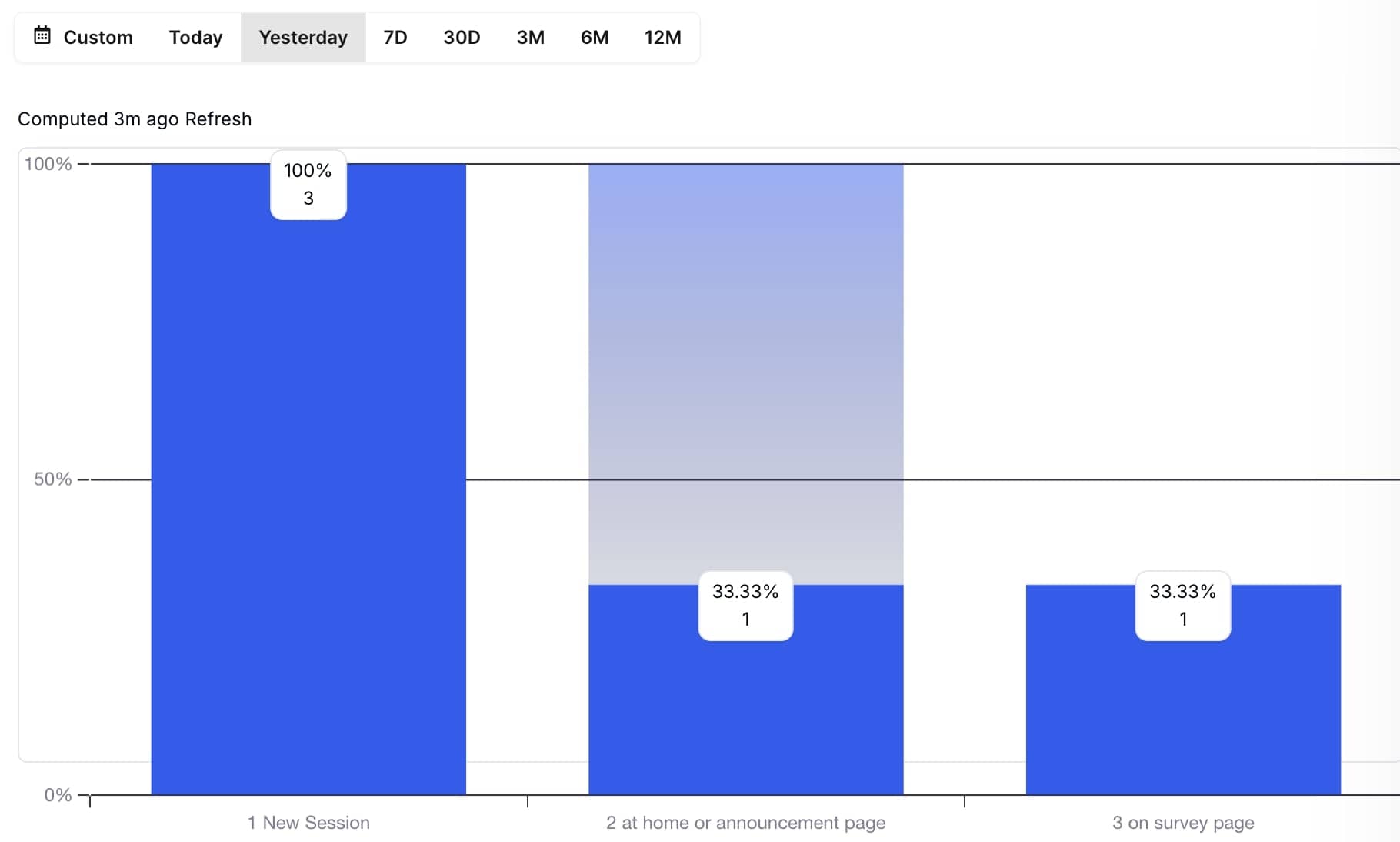
Every multi-step process in your product is a funnel. Onboarding is a funnel. Checkout is a funnel. Feature adoption is a funnel.
Tracking where users drop out reveals exactly where friction peaks. If 100 users start onboarding and 70 finish step one, you've lost 30% immediately. That step is too confusing, too time-consuming, or users don't understand why they're doing it.
The bigger the drop-off at a specific step, the clearer the problem. It's hard to get more direct feedback than users actively abandoning your flow.
Compare drop-off rates across cohorts, user types, or signup sources. Maybe users from ads drop off at different rates than users from organic. Maybe enterprise users navigate differently than SMBs. Maybe users from one campaign are better primed for your onboarding than another.
The feedback is: "Make step X clearer, faster, or more obviously valuable."
Feature Usage Reality
You built something. You shipped it. You assumed users would love it.
Nobody uses it.
This happens because you optimized for what you thought the problem was, not what users actually needed. Or the UX makes it hard to discover. Or it's in the wrong place. Or users solved it a different way first.
When feature adoption is near-zero, it's not always the feature that's the problem. Sometimes it's discovery. Sometimes it's that users never encountered the use case. Sometimes it's the feature is actually bad.
The only way to distinguish is to instrument adoption, then ask users why they're not using it.
Part 5: Closing the Loop
Here's something I see constantly: teams collecting feedback at massive scale and responding to almost none of it.
You run a survey. 60% of users tell you your checkout is confusing. You make a note. You do nothing. Next quarter, your conversion rate is unchanged and users assume you don't listen.
This is how you kill engagement. Not by shipping a bad product, but by making customers feel unheard.
Closed-loop feedback means: collect → analyze → implement → communicate → repeat.
When a customer requests a feature, they need to know it's been received. When you ship it, they need to see it. When issues arise, customers need acknowledgment that someone's investigating. When bugs are fixed, affected users need to hear it.
This doesn't mean responding to every suggestion. It means responding to something - showing customers that feedback drives decisions.
Public roadmaps with upvoting mechanisms create this feedback loop. Customers submit ideas. Other customers vote. You ship winning ideas. You update the roadmap. People see their input mattered.
This is respect in product form. And it's shockingly rare.
Your Feedback Gaps
If you're only running quarterly NPS surveys, you're not gathering feedback. You're taking your pulse once every three months and assuming you understand what's happening.
You need layers. Real-time signals (usage patterns, activation tracking, churn indicators). Tactical feedback (CSAT, CES at specific moments). Strategic insight (NPS, qualitative themes). Action feedback (feature requests, bug reports).
The absolute baseline: you should know within 24 hours when something breaks. Users are telling you through their behavior. You're just not listening.
You should know within a week when an onboarding cohort isn't activating. You should know within two weeks when feature adoption is flat. You should know when users are leaving, long before they hit the cancel button.
Most teams know none of this because they're focused on the surveys instead of the signals.
Quick Wins
Stop planning. Start measuring. Pick one thing this week:
-
Define your activation event. What specific sequence of actions means a user has found value? Can you describe it in one sentence? If not, that's why users aren't finding it.
-
Track trial-to-paid conversion by cohort. Which new user cohorts are converting to paid at the highest rates? What did they do differently in their first week?
-
Audit your churn signals. Which users are at risk right now based on behavior? Don't guess - look at login frequency, feature engagement, support ticket volume. Reach out to the highest-risk users with a simple question: "What would make you continue with us?"
-
Measure feature adoption. What percentage of your user base has actually used your top three features? How many came back after the first try?
-
Map your help center usage. What are users searching for? What's creating the most questions? Build documentation for high-search topics.
Start there. You'll immediately find feedback you didn't know you were missing.
Core Problems
They're too passive.
You build a form. You hope users fill it out. You wait. Feedback trickles in. By the time you analyze it, weeks have passed. You've already shipped the next thing, and the problems you're identifying are old news.
Active feedback collection means you're measuring behavior continuously. You're not waiting for users to fill out a survey - you're watching what they do and responding in real-time.
When activation drops, you notice immediately. When a feature has zero adoption, you know within days. When specific cohorts are struggling, the signal is clear.
This is the difference between feedback culture and feedback theater. Most teams do theater - they send surveys and celebrate that they're "listening." Real product teams obsess over signals and respond ruthlessly.
Common Mistakes
-
They collect without analyzing. A thousand survey responses nobody reads. Feature request boards nobody prioritizes. Support tickets nobody aggregates. Garbage in, garbage out.
-
They measure the wrong things. Monthly NPS is fine for executive reporting, but it won't help you fix your onboarding next week. You need daily signals, not monthly trends.
-
They don't close the loop. They collect feedback, ignore it, then act surprised when users feel unheard. Feedback collection without response is worse than no feedback program at all.
-
They treat feedback as "nice to have." Feedback should drive decisions. If feedback isn't influencing your roadmap and your onboarding and your feature prioritization, you don't have a feedback culture - you have a suggestion box nobody reads.
The Right Stack
You don't need infinite tools. You need the right tools working together:
Real-time behavior tracking shows you what users are actually doing. Login patterns, feature usage, activation milestones, churn signals.
Tactical feedback collection captures explicit input at moments that matter - CSAT after support, CES after checkout, NPS for power users.
Feature request management creates a visible feedback loop where users see their ideas influence your roadmap.
Communication and response closes the loop through announcements, changelogs, and public roadmaps that show customers their input matters.
Analysis and synthesis finds patterns in qualitative feedback through AI-powered theme extraction, so you're not drowning in text.
When these layers work together, feedback stops being noise and becomes signal. Customers feel heard. Your product improves faster. Churn drops. Growth accelerates.
And most importantly - you stop guessing about what your customers actually need and start knowing.
Key Takeaway
Your customers are giving you feedback constantly. They're doing it through surveys, support tickets, feature requests, and behavior. They're telling you through login patterns, feature adoption, email engagement, and activation journeys.
The question isn't whether they're providing feedback. The question is whether you're sophisticated enough to listen.
Most teams aren't. They hear the surveys and miss the signals. They celebrate a 45 NPS and ignore that 40% of their users never activated.
Start listening to the invisible feedback. Watch what users do when nobody's explicitly asking. Respond quickly. Close the loop. Repeat.
That's not just best practice. That's the difference between products that grow sustainably and products that watch users leave wondering why.
The feedback your customers desperately want to give you - the feedback about what's actually working and what's broken - isn't hiding. It's hiding in plain sight.
What's the most important feedback signal you're currently ignoring? Start tracking it this week
Further Reading
If you want to go deeper on any of these topics, here's what's worth your time:
On Building Better Feedback Loops
On Measuring What Matters
-
Understanding Net Promoter Score (NPS): A Critical Metric for SaaS Success (Monetizely)
-
User Behavioral Analysis: What Is It and How To Perform It (Userpilot)
On Feature Decisions & Prioritization
On Understanding User Behavior
On Continuous Feedback Culture
Start with the feedback loop articles if you're weak on that end. If you're solid on collection but struggling with metrics, go to the NPS and behavioral analysis pieces. If you just want a checklist of what you should be measuring, the Intercom takeaways will save you weeks of internal debate.
The uncomfortable truth: most of these articles won't change what you do tomorrow. What matters is starting with one concrete signal you're not currently tracking and instrumenting it this week. That single action will teach you more than reading ten articles combined.


