Learn how to add tooltips to your product in this step-by-step article.
Tooltips help you explain a specific button, icon, menu item, field, or feature directly inside your product. In Userorbit, a tooltip is created as a Tooltip guide, powered by a Pointer / Tooltip step.
This guide shows how to create a tooltip and attach it to a control in your app.
When to use a tooltip
Explain what a button or icon does.
Introduce a new feature without interrupting users.
Guide users toward a specific action.
Add contextual help to a dense or unfamiliar screen.
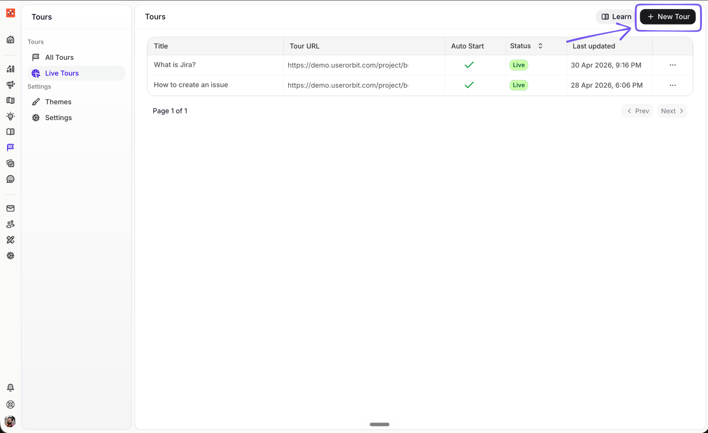
Step 1: Create a new tour
Open Tours and click New Tour.
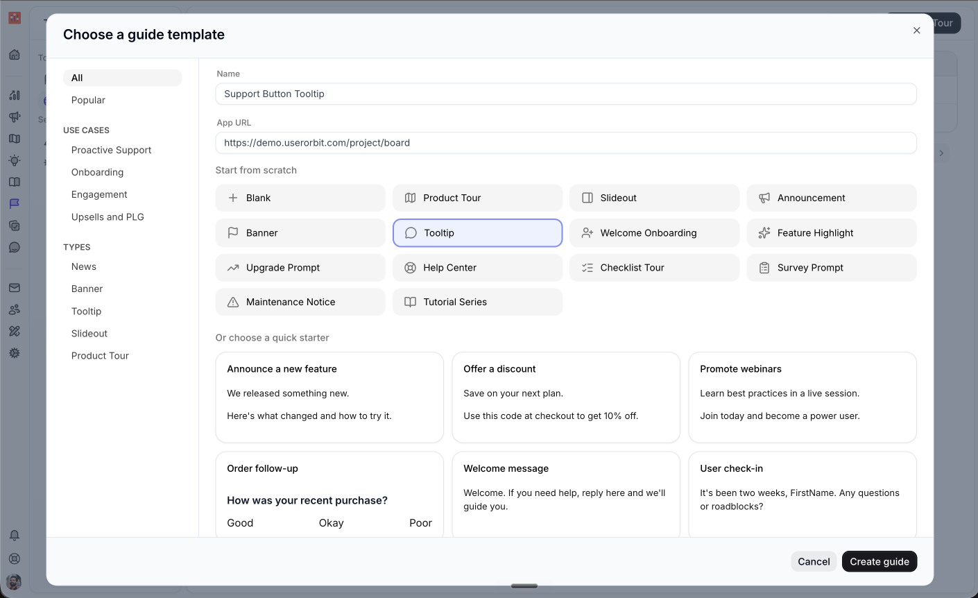
Step 2: Choose the Tooltip template
Enter a name for the tooltip and the app URL where the tooltip should appear. Then choose Tooltip from the template list and click Create guide.
Step 3: Add the tooltip content
The guide opens with one tooltip step. In the content editor, write the message users should see.
Keep the copy short. A good tooltip usually explains what the control does and why the user may want to use it.
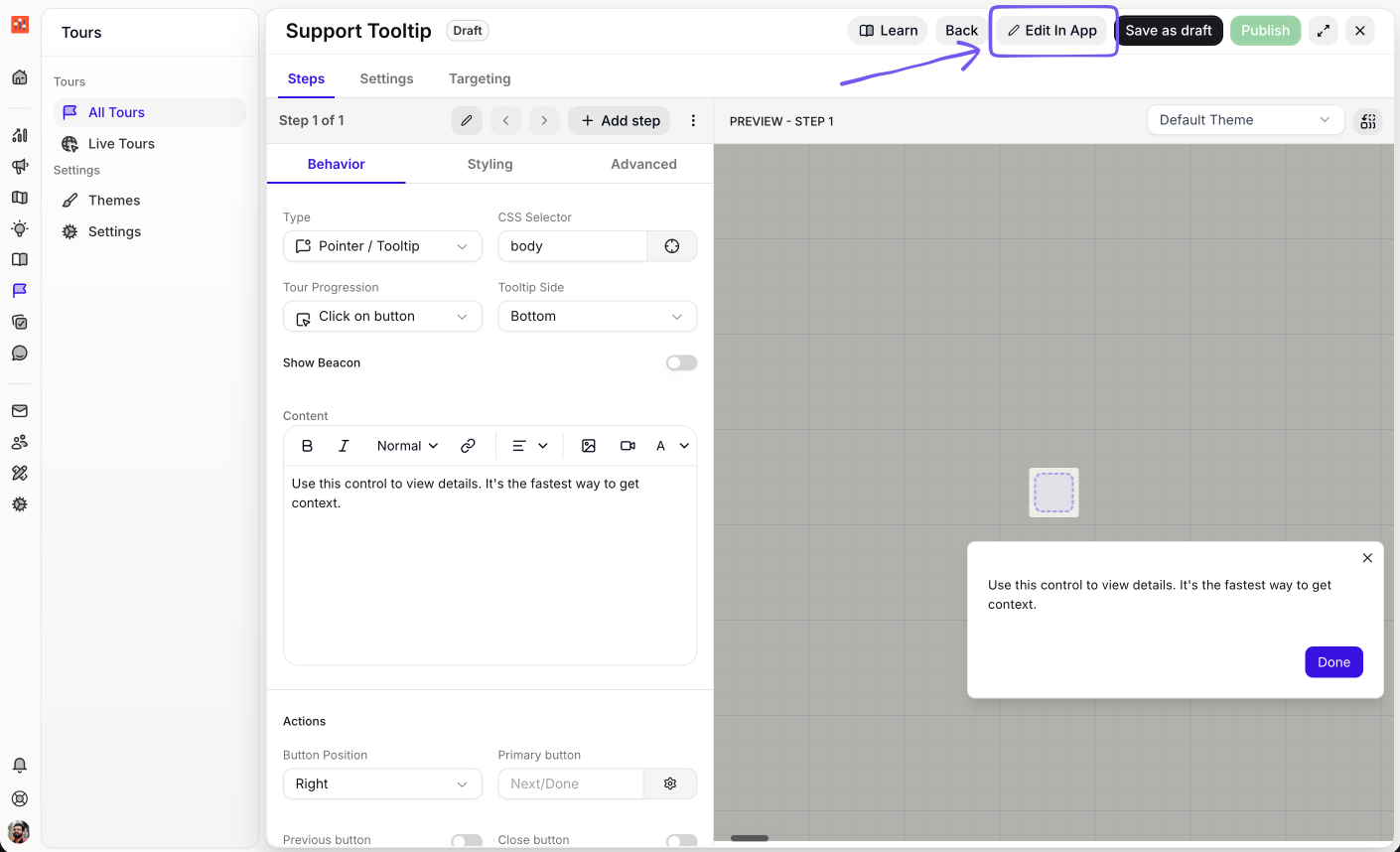
Step 4: Open the in-app builder
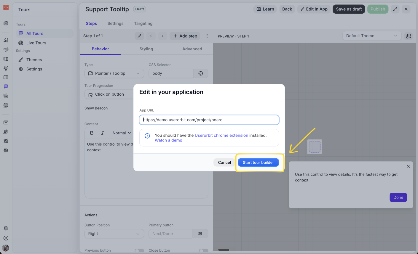
Click Edit In App. Confirm the app URL, then click Start tour builder.
You need the Userorbit Chrome extension installed to select elements visually in your app.
Step 5: Choose the button or icon
In the builder, click the choose element control next to the CSS Selector field. Then select the button, icon, or element where the tooltip should appear.
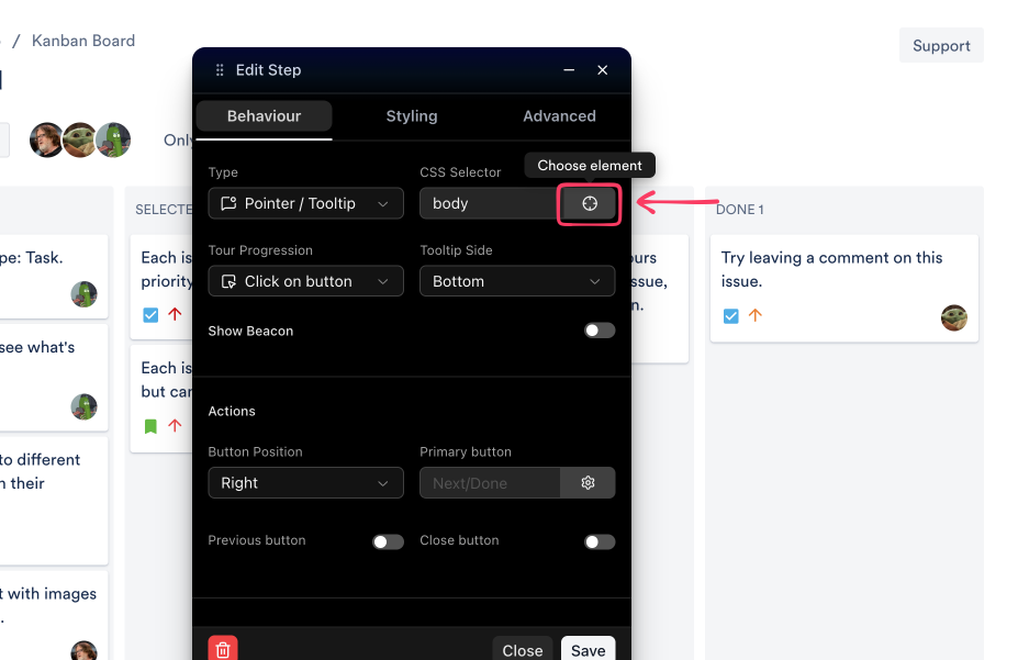
Userorbit stores the selected element as a CSS selector. If you enter a selector manually, use a stable selector such as #invite-button, [data-testid="support-button"], or [data-uo="settings-icon"].
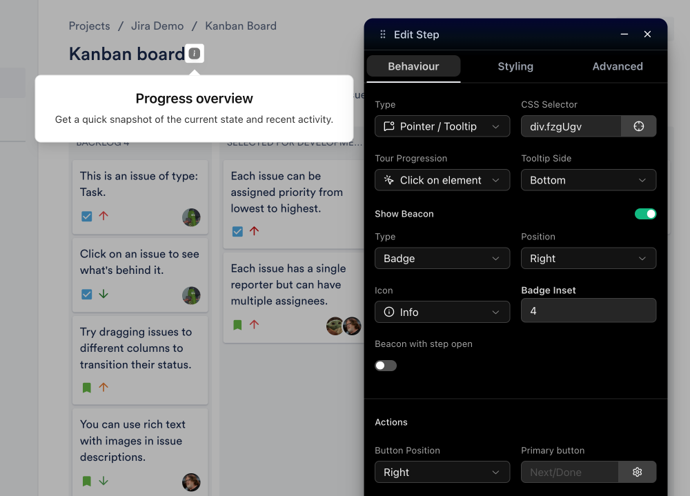
Step 6: Configure the tooltip behavior
After selecting the element, configure how the tooltip should behave.
Type: keep this set to Pointer / Tooltip.
Tour Progression: choose Click on button when users should continue by clicking the tooltip CTA.
Tour Progression: choose Click on element when users should click the highlighted element itself.
Tooltip Side: choose where the tooltip appears around the target element.
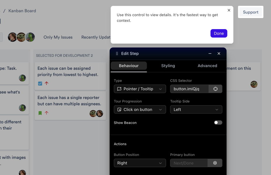
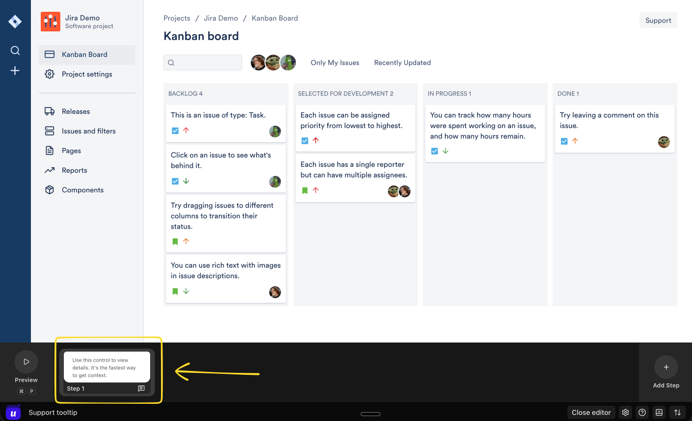
Step 7: Review the step in the timeline
The tooltip step appears in the timeline at the bottom of the in-app builder. Use this area to preview the step, add more steps, or confirm the tooltip flow before publishing.
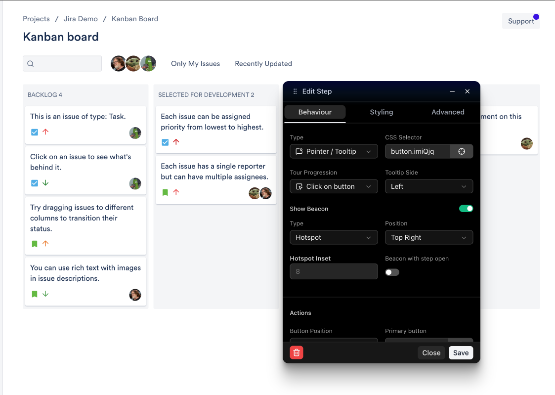
Optional: Add a beacon or badge
If you want to draw attention to the element before the tooltip opens, turn on Show Beacon.
You can use a hotspot, badge, or label depending on how visible the prompt should be.
Step 8: Save, preview, and publish
Click Save after configuring the step.
Preview the guide and confirm the tooltip appears on the right element.
Check that the tooltip copy, position, and button behavior are correct.
Publish the guide when it is ready.
Best practices
Keep tooltip text short and specific.
Use one tooltip to explain one action.
Use Click on element only when the user should perform the real action.
Use beacons sparingly so they remain noticeable.
Prefer stable CSS selectors such as IDs or data attributes.
Preview the tooltip on different screen sizes before publishing.
Troubleshooting
The tooltip does not appear
Confirm the guide is published.
Confirm the user matches the targeting rules.
Confirm the page URL matches the guide URL.
Use a more stable selector if the target element changed.
The tooltip appears in the wrong place
Change the tooltip side.
Check whether the selected element moves after the page loads.
Use a more specific selector for the target element.