Product tour themes now support dedicated light and dark variants. You can design a tour once, tune each mode separately, and preview how modals, slideouts.
Product tour themes now support dedicated light and dark variants. You can design a tour once, tune each mode separately, and preview how modals, slideouts, banners, tooltips, checklists, and surveys will look before you publish.
This is useful when your application supports dark mode, follows the user's system preference, or needs a tour experience that feels native in both light and dark interfaces.
Open the tour theme editor
From the dashboard, open Product Tours.
Select Themes, or open the theme editor directly at /tours/design.
Choose an existing theme from the theme selector, or click New Theme to create a new one.
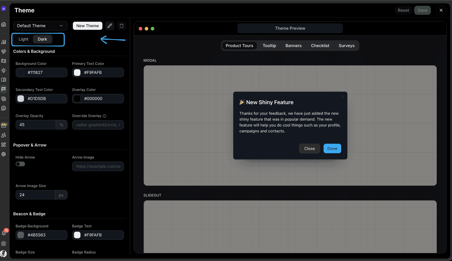
Configure light and dark variants
Use the Light and Dark toggle at the top of the theme controls.
Start with Light and set the base colors, text colors, overlay, buttons, borders, popover styling, arrow settings, beacon, and badge styles.
Switch to Dark and adjust the same fields for dark backgrounds and higher-contrast text.
Watch the Theme Preview while editing. The preview shows how the selected mode will render across product tours, tooltips, banners, checklists, and surveys.
Click Save when both variants look right.
Apply a theme to a tour
Open the tour you want to style.
In the tour builder, choose the theme from the theme selector.
Preview the tour in both modes before publishing.
If a single step needs different styling, enable the step-level theme override from the step styling settings.
Match your application theme
If your product controls its own light and dark mode, pass the desired theme mode when initializing the Userorbit SDK:
userorbit.init({
  accountId: "YOUR_ACCOUNT_ID",
  theme: "system",
});TypeScript
The supported values are:
"light"- always render the light variant."dark"- always render the dark variant."system"- follow the user's operating system or browser preference.
When your app theme changes after initialization, update Userorbit without reloading the page:
await userorbit.updateTheme("dark");TypeScriptBest practices
Design both modes intentionally. Do not rely on a light theme to work automatically on dark backgrounds.
Check contrast in the preview. Pay extra attention to secondary text, overlays, disabled buttons, and badge colors.
Use system mode when possible. It respects user preference and keeps your tours aligned with the rest of the product.
Keep theme names clear. Use names like Default Theme, Launch Dark, or Enterprise Onboarding so teammates can pick the right theme quickly.
Troubleshooting
If a tour does not appear in the expected mode, check these areas:
Confirm the SDK is initialized with the expected
themevalue.Make sure both light and dark variants have been saved in the theme editor.
Check whether the current tour step has a step-level theme override enabled.
If using
"system", verify the browser or operating system preference you are testing with.